Accenture is a financial consulting firm with 300,000 associates worldwide. This is a small survey of a few of the UX and visual design projects produced for Accenture's CIO Design Agency. Most of the work is complex analytic, forecasting and scheduling applications, including custom data visualization design for nearly any necessary metric.
Additionally, our cohort created an internal Design System and accompanying library (think Bootstrap) to provide common patterns and behaviors non-designers and developers can refer to when creating new sites and apps that maintain recognizable styles and actions across the entire Accenture organization.
All CIO projects are executed using current AGILE methodologies with weekly design sprints. They rely heavily on user personas to identify areas of friction to be addressed and improved. People with Disabilities (PwD) compliance is an essential UX practice. All visual design within the Accenture CIO design agency adheres to a strict protocol of PwD testing and implementation during the design process.
The following is a selection of projects and their stories in varying degrees of detail.
Manage My Business (MMB)
Role: Visual Design, Art Direction, Experience Design
Tools: Sketch, Adobe Illustrator, InVision, Axure, Trello
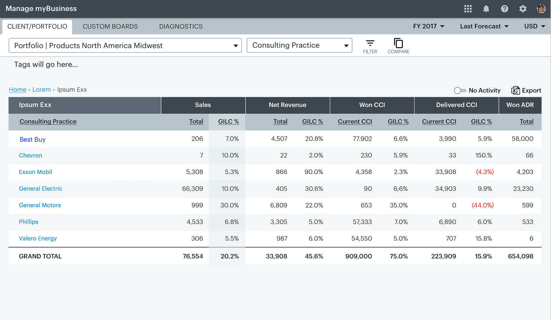
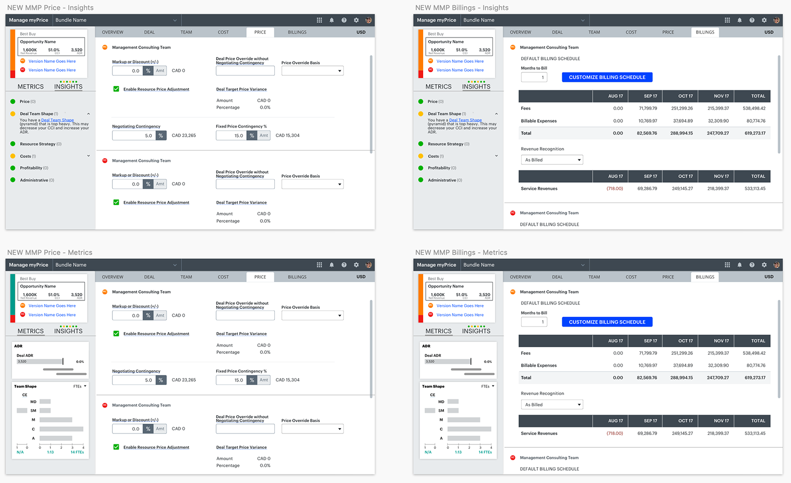
An analytics tool that allows Accenture consultants to see their numbers from high to granular levels by client, region, sector, group, or any variation.
When I first joined the Accenture CIO Design Agency, MMB was relatively new and had the existing, quadrant-based layout you will encounter below. Several months were spent adding new features and designing new visualizations within the framework of that existing UI. A complete UX/UI overhaul was on the back burner and would eventually come as we developed universal patterns for another large tool project, Manage My Pricing (MMP).
Let's get into the story.
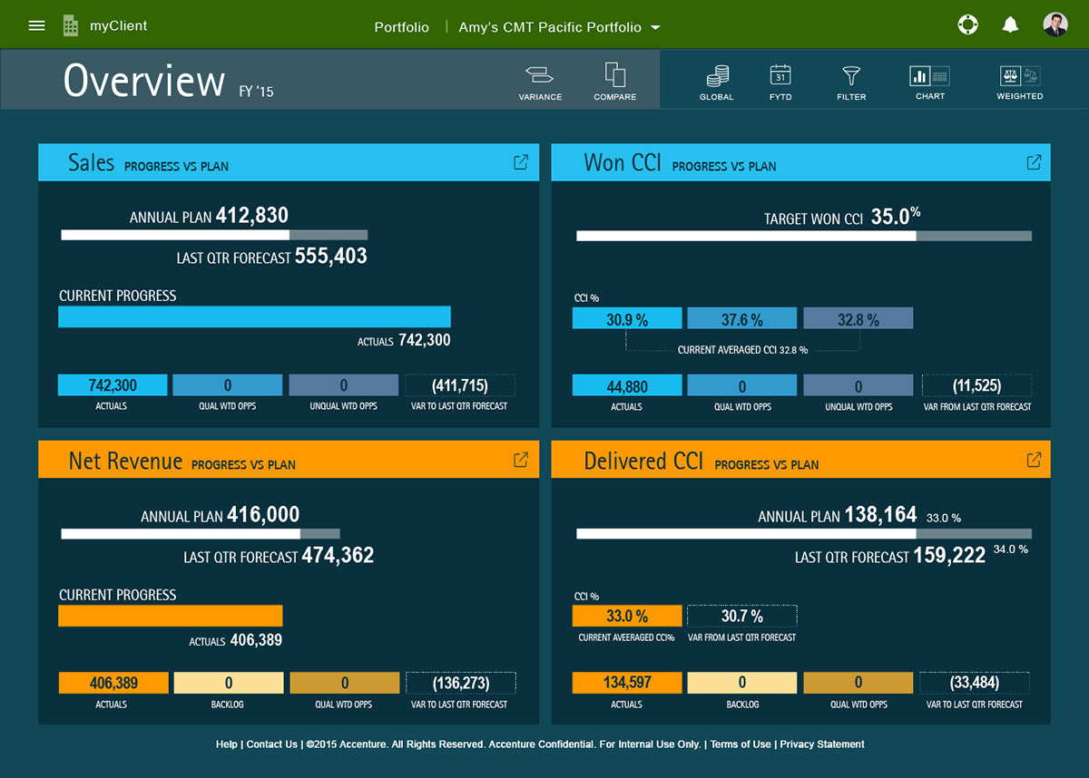
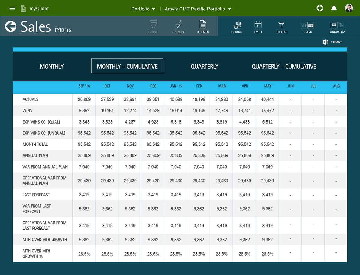
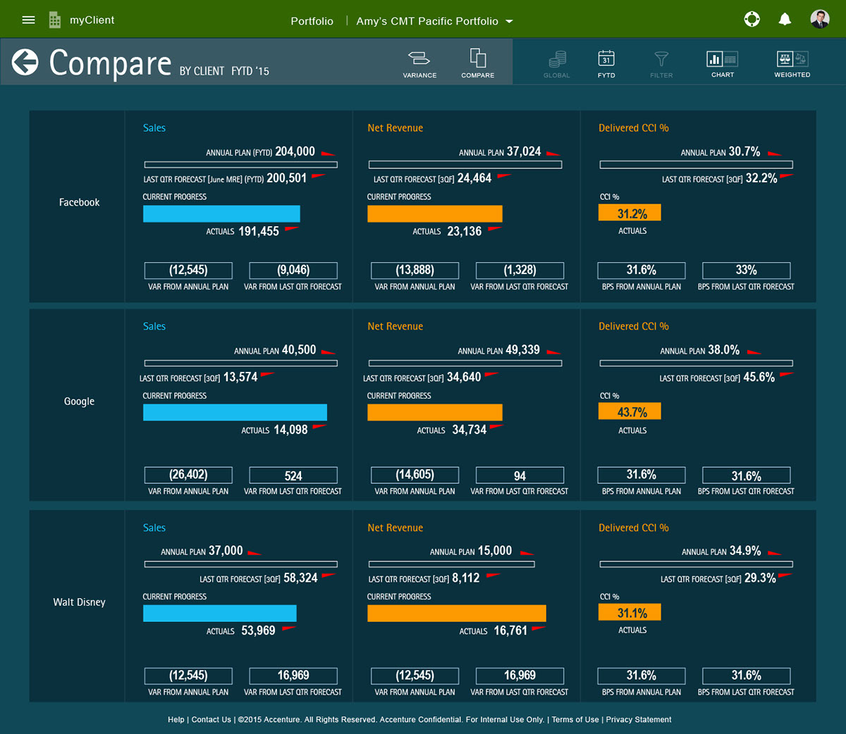
What you see below is what MMB looked like when I first arrived. Sales and CCI were separated into expandable quadrants that provided an overview once the user logged in. Each quadrant could be expanded to show more detail, and various filter/sorting groupings provided a way to toggle chart types, tables, timeframes, etc. The original designers intended for this look to fit on the most common screens without any need to scroll, a good intention that ultimately hamstrung added features down the road. PwD compliance had not been taken into consideration, either, and upon testing, many of the elements did not pass even single A compliance standards. Furthermore, this look did not match any other tool in the family apart from basic branding rules.
The redesign began simultaneously with the redesign of MMP and early passes at creating the Accenture Experience Design System.
What you see immediately below was the pre-existing layout, which clearly had usability issues.
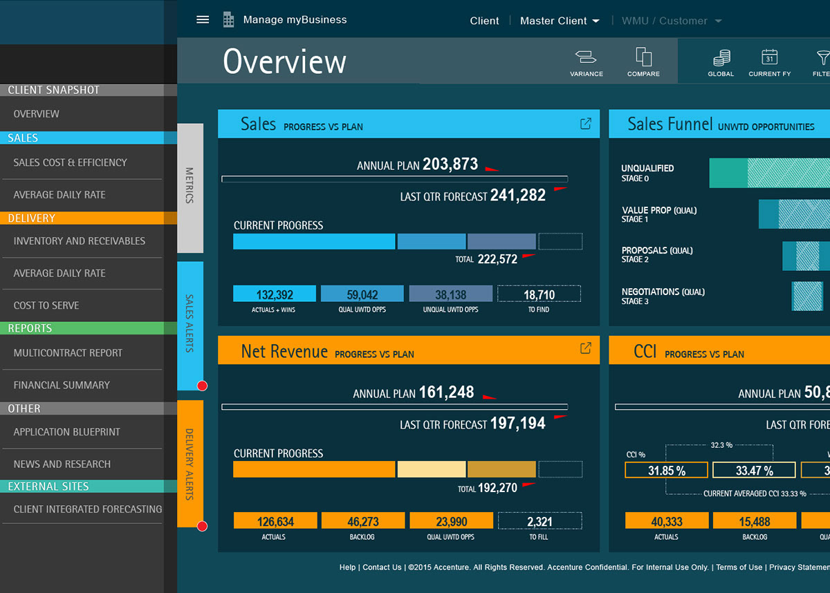
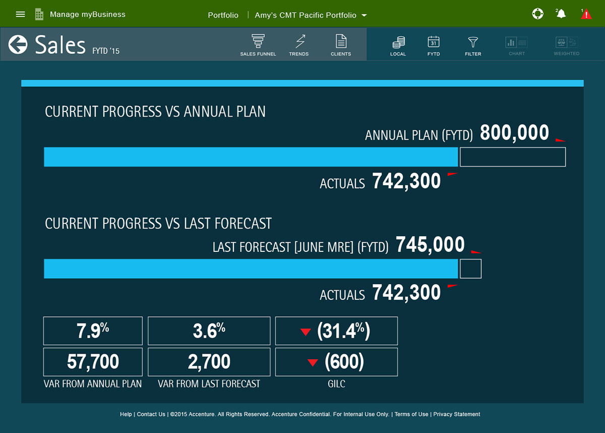
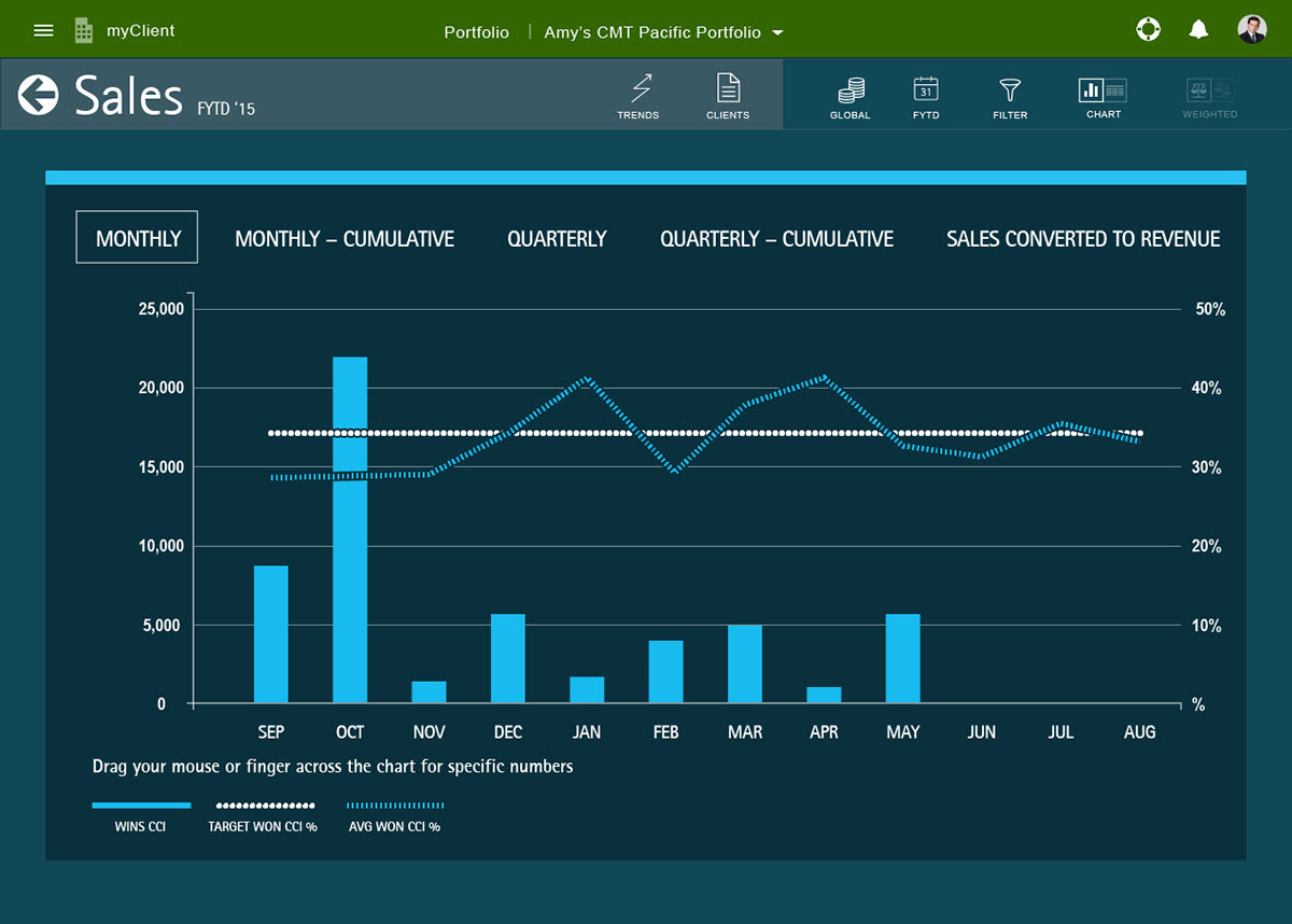
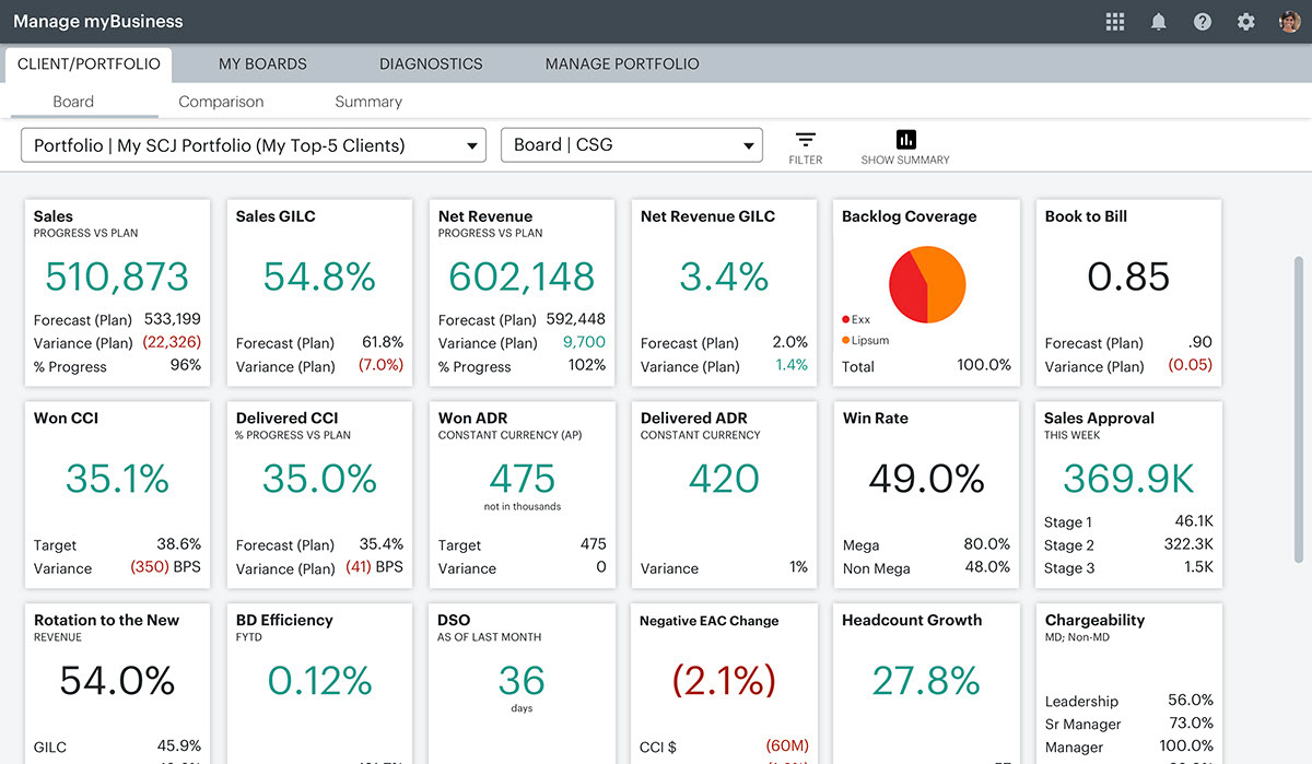
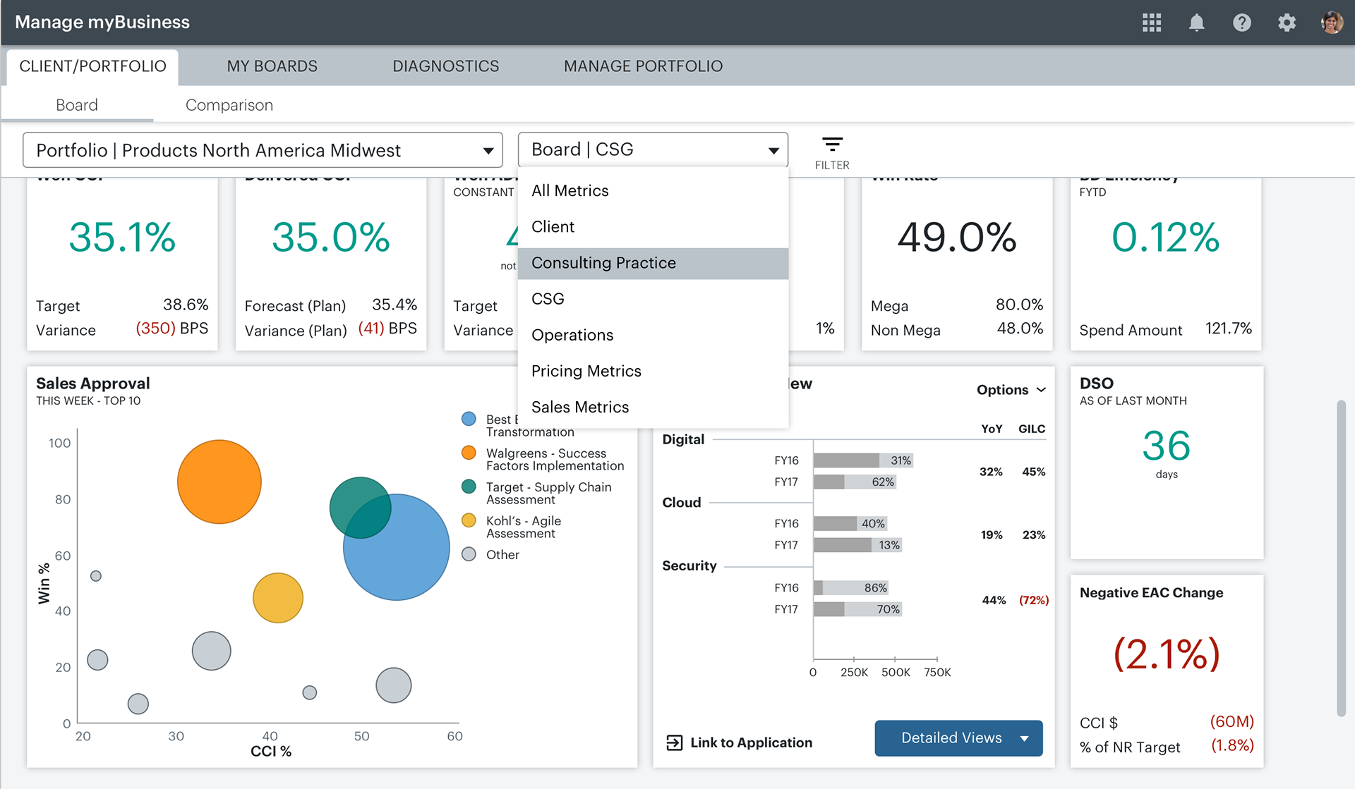
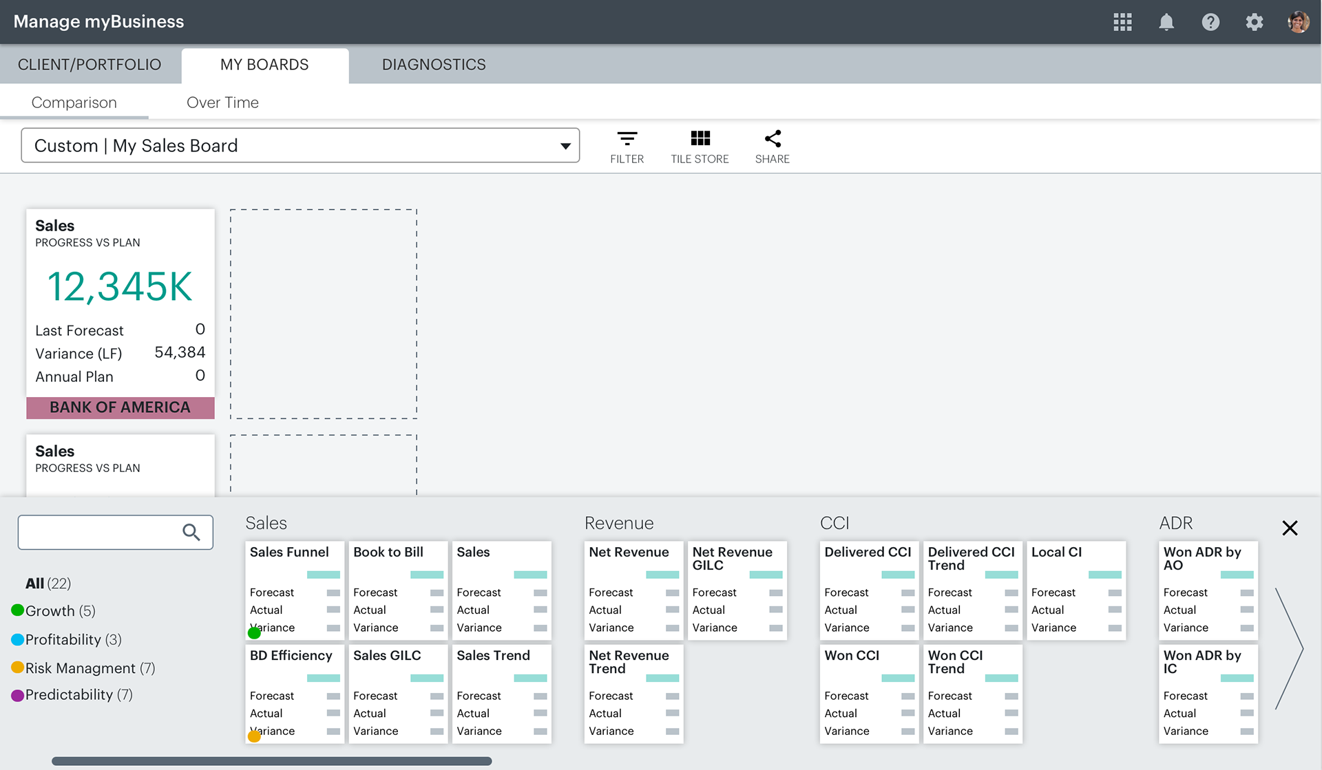
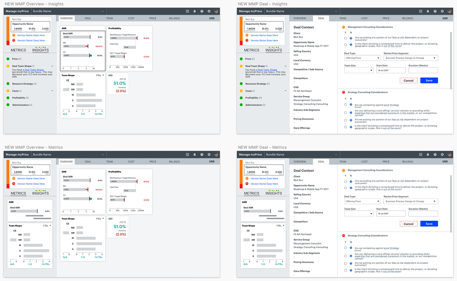
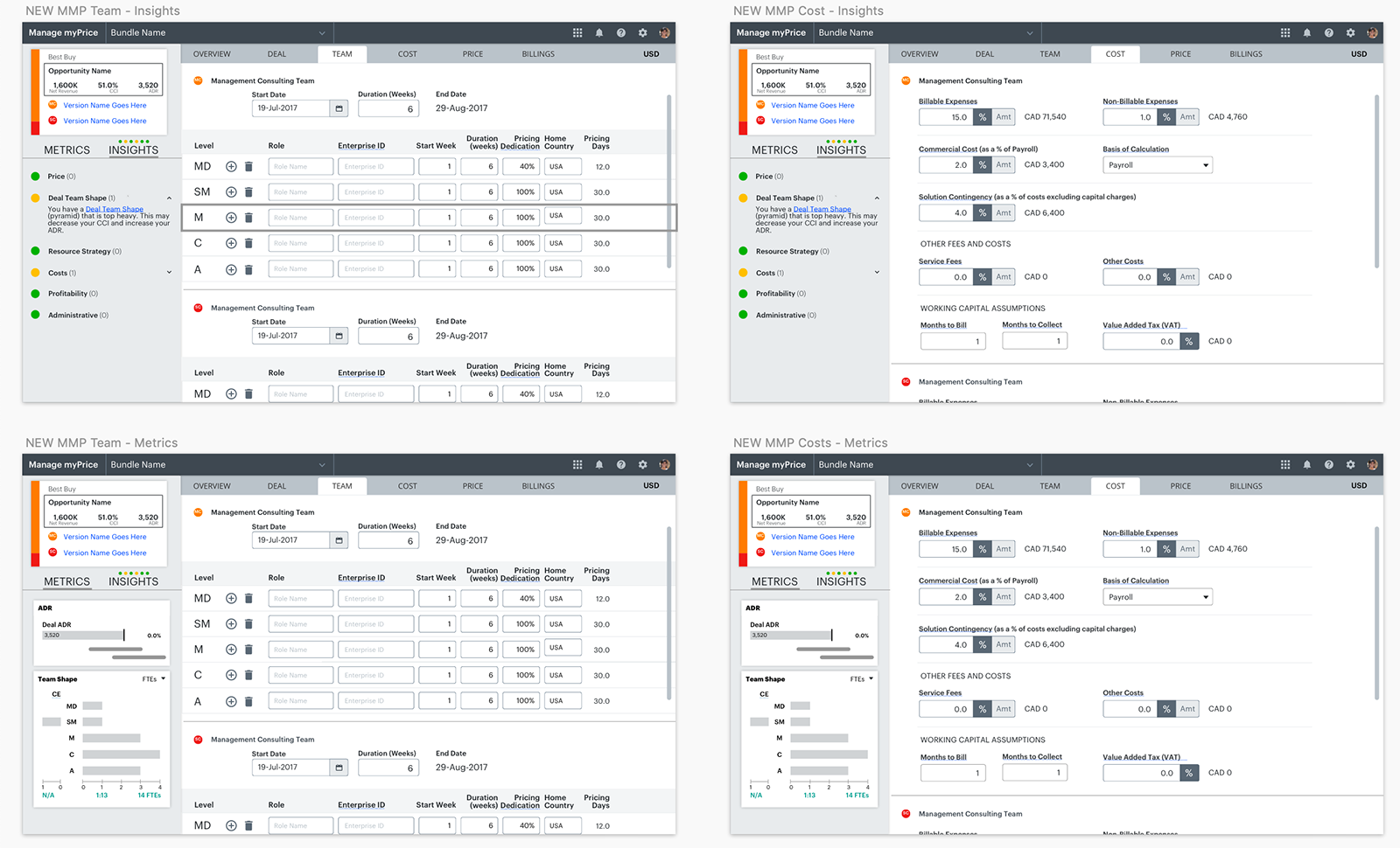
Besides the Accenture Experience Design System's universal header, a new component featured heavily in the new look and experience of the new layout across all of our tools is tiles. A proof of concept for the way tiles would work is HERE. These tiles each represent a single metric and can be approached in a few ways. A click enlarges the tile to the next state which would contain increasing levels of detail for each metric, the whole cycle from small > medium > large > small requiring only three clicks. Once the user has their landing page configured with the metrics they need, as few or as many as they want, they can click into the tiles in two levels of zoom, enlarging the tile to see more data. As tiles enlarge, neighboring tiles push over to make way, always remaining visible. The sorting and filters groups were redesigned from top to bottom and added to the Design System's common patterns. New design stepped back from the former dark backgrounds approach and tested for PwD compliance in the earliest stages.
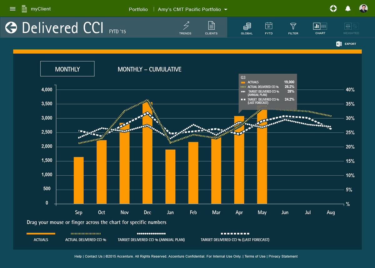
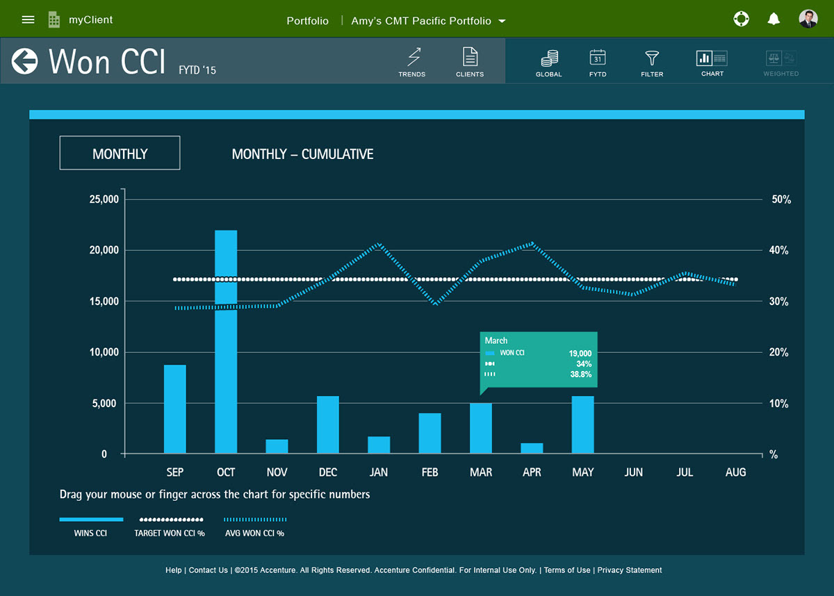
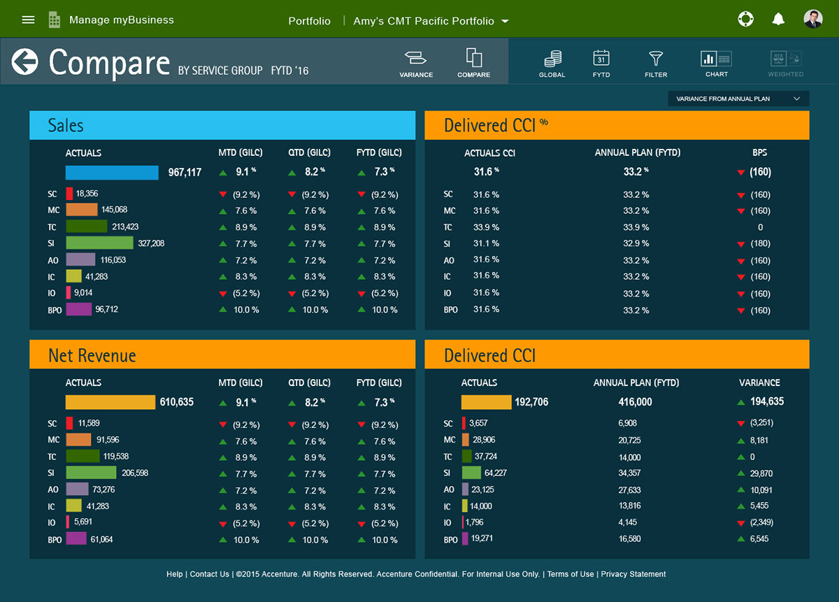
All screenshots below taken from the working Sketch files. This is a tiny selection of hundreds of screens that were designed for MMB and MMP alone.
Manage My Pricing (MMP)
Role: Art Direction, Visual Design
Tools: Sketch, InVision, Adobe XD, Slack, Trello
A tool that allows Accenture consultants to analyze their deals, adjust pricing and forecasts. I did the high-fidelity visual design with a team comprised of a UX lead and two developers.
The example you see here is a partial overview of the style guide created to help developers lay out future add-ons and maintain the high visual integrity of the application. This guide contributed to the creation of common patterns for version 1.0 of the Accenture internal Design System.
This early rendition of MMP represents the beginnings of the tiling system that evolved into a universal way for users to drill into any number of custom metrics. This tiling system became foundational for the redesign of MMB, seen above with the tiles more fully fleshed out.
High-fidelity MMP screens taken from Sketch in various states
High-fidelity MMP screens taken from Sketch in various states
High-fidelity MMP screens taken from Sketch in various states
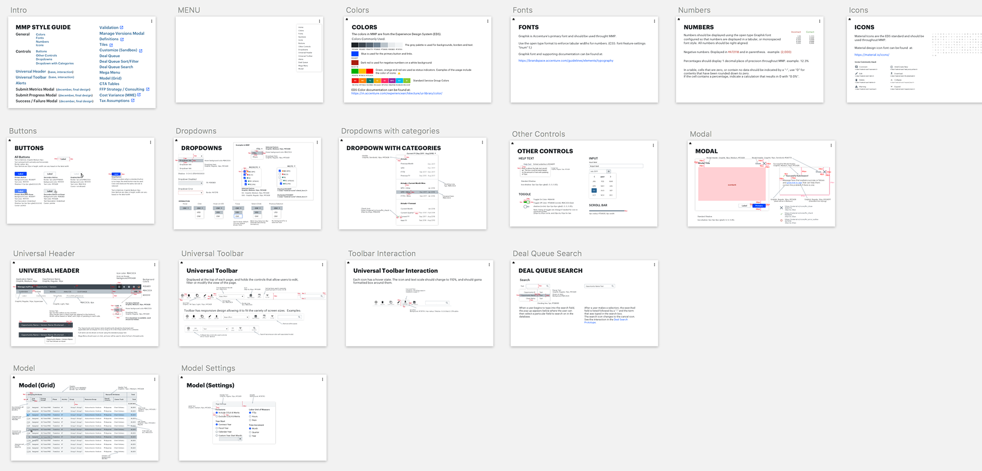
The MMP styles represents the main starting point for the new Accenture Experience Design System, developed to establish consistency across Accenture tools worldwide with common patterns and code snippets.
PLACES – The Accenture Global Office Experience
Role: Experience Design, Visualize User Stories
Tools: Sketch, InVision, Adobe Photoshop, Adobe XD
With 300,000 associates in offices around the globe, building access and navigating various locales can be daunting. This application is designed to replace employee badging so people can simply use their phone to identify themselves and gain entry past HID card readers. Additionally, the app can help associates connect with team members in their destination office building and book rooms for meetings. 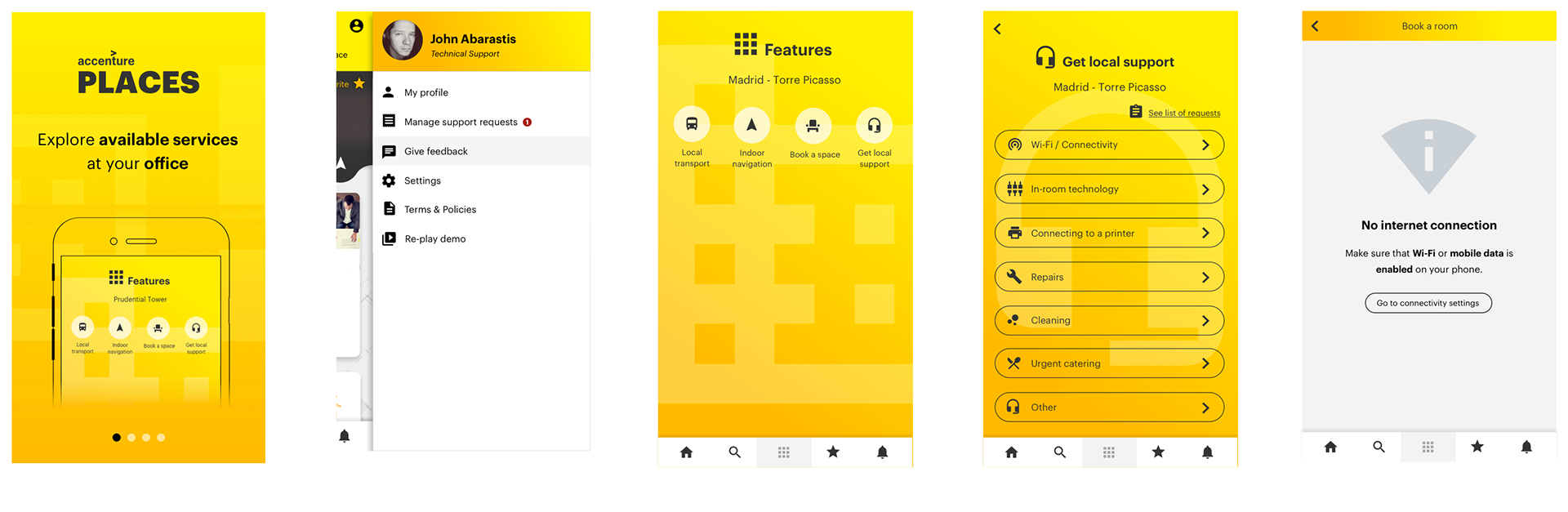
Examples of primary screens and available actions
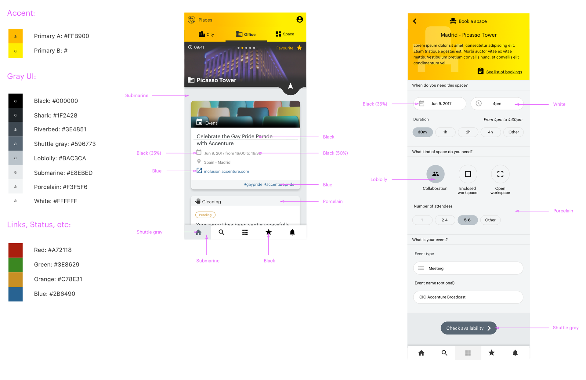
Style definitions
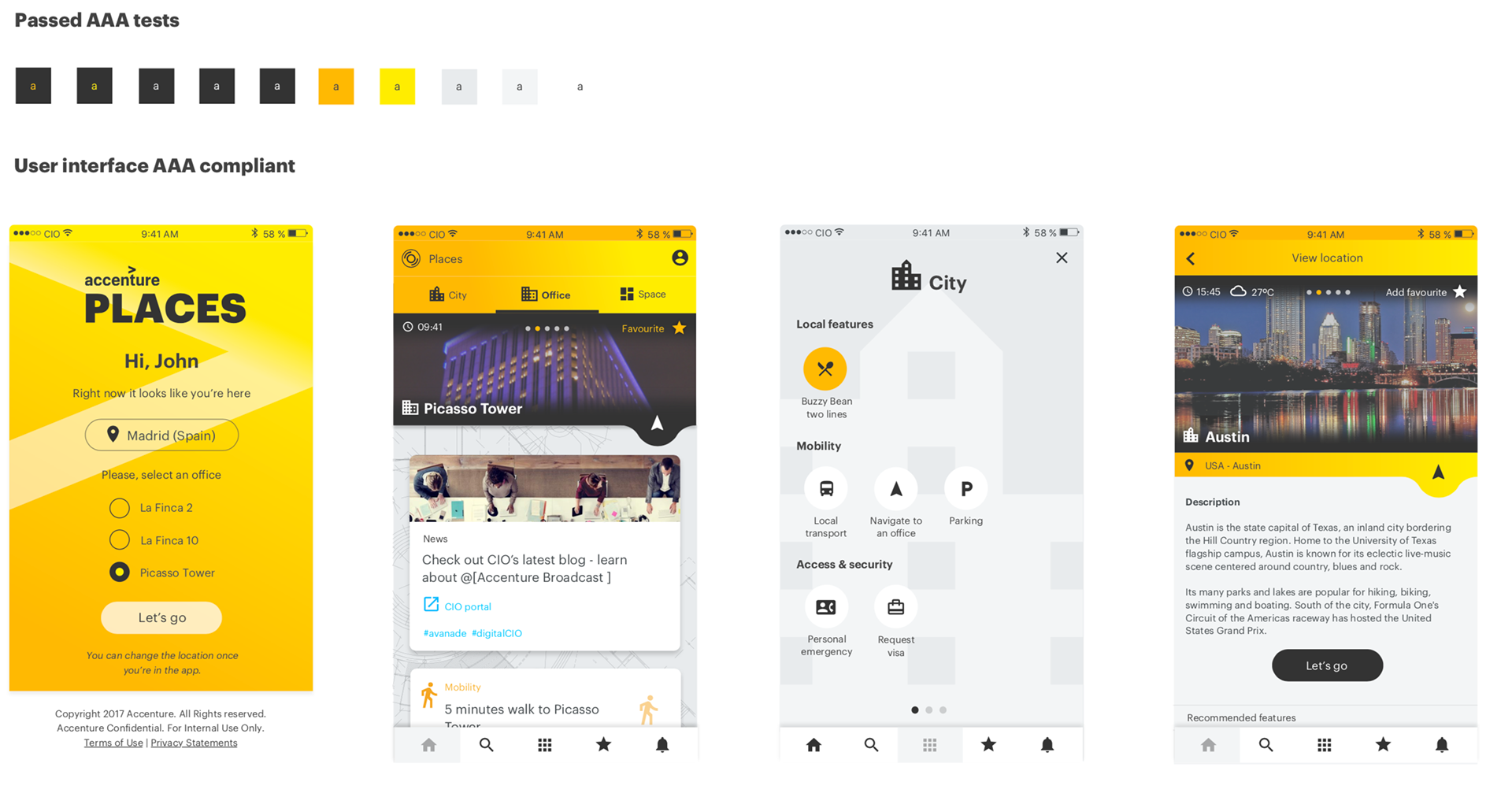
People with Disabilities (PwD) compliance with exemplified screens
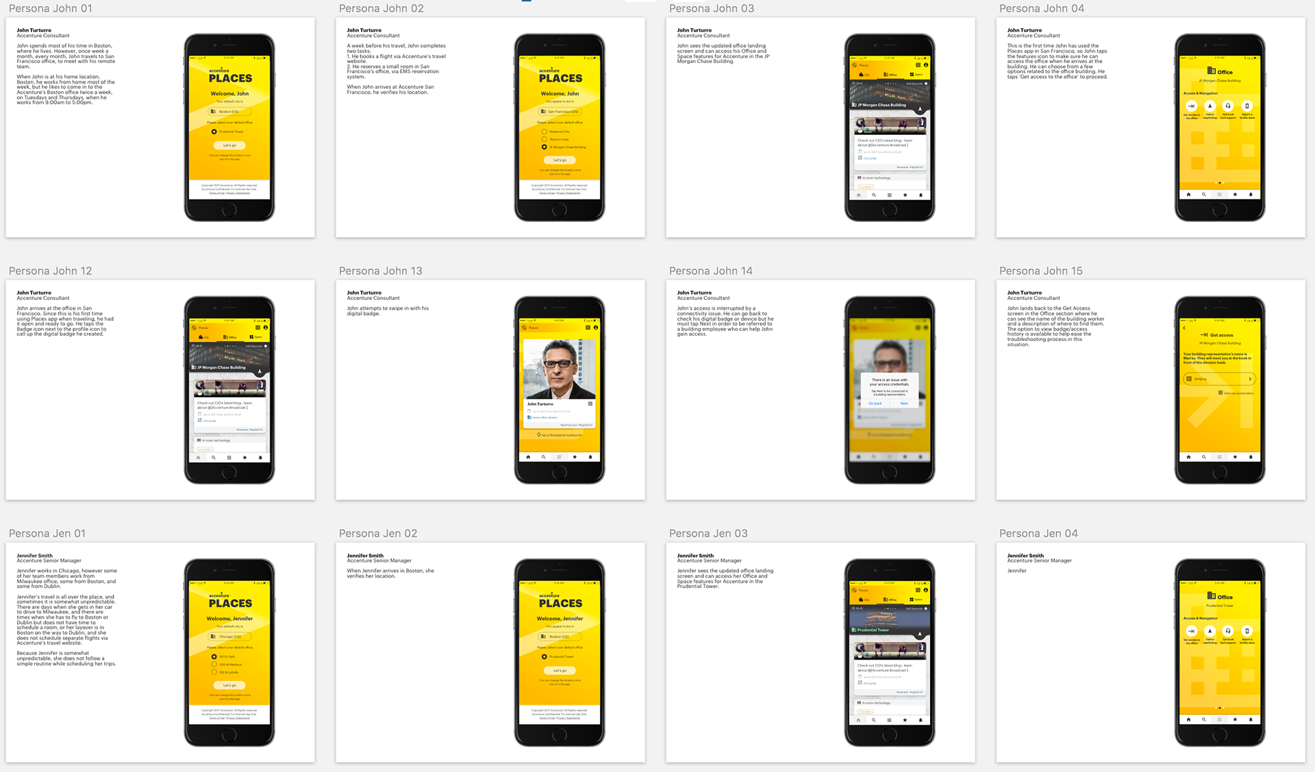
User flows that describe how user 'John' would create a digital badge for himself using the Places app
Talent Pathways / Capacity Interlock
Role: Art Direction, Visual Design, Experience Design
Tools: Adobe XD, Sketch, InVision, Axure, Microsoft Teams
A recruiting tool for planning team make-up and budget with dynamic visualizations.
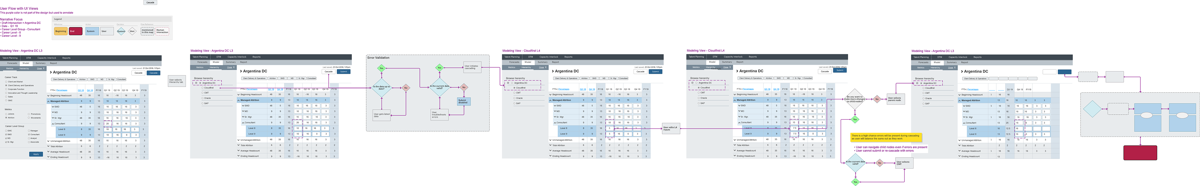
In-depth user flow studies over low fidelity layouts.
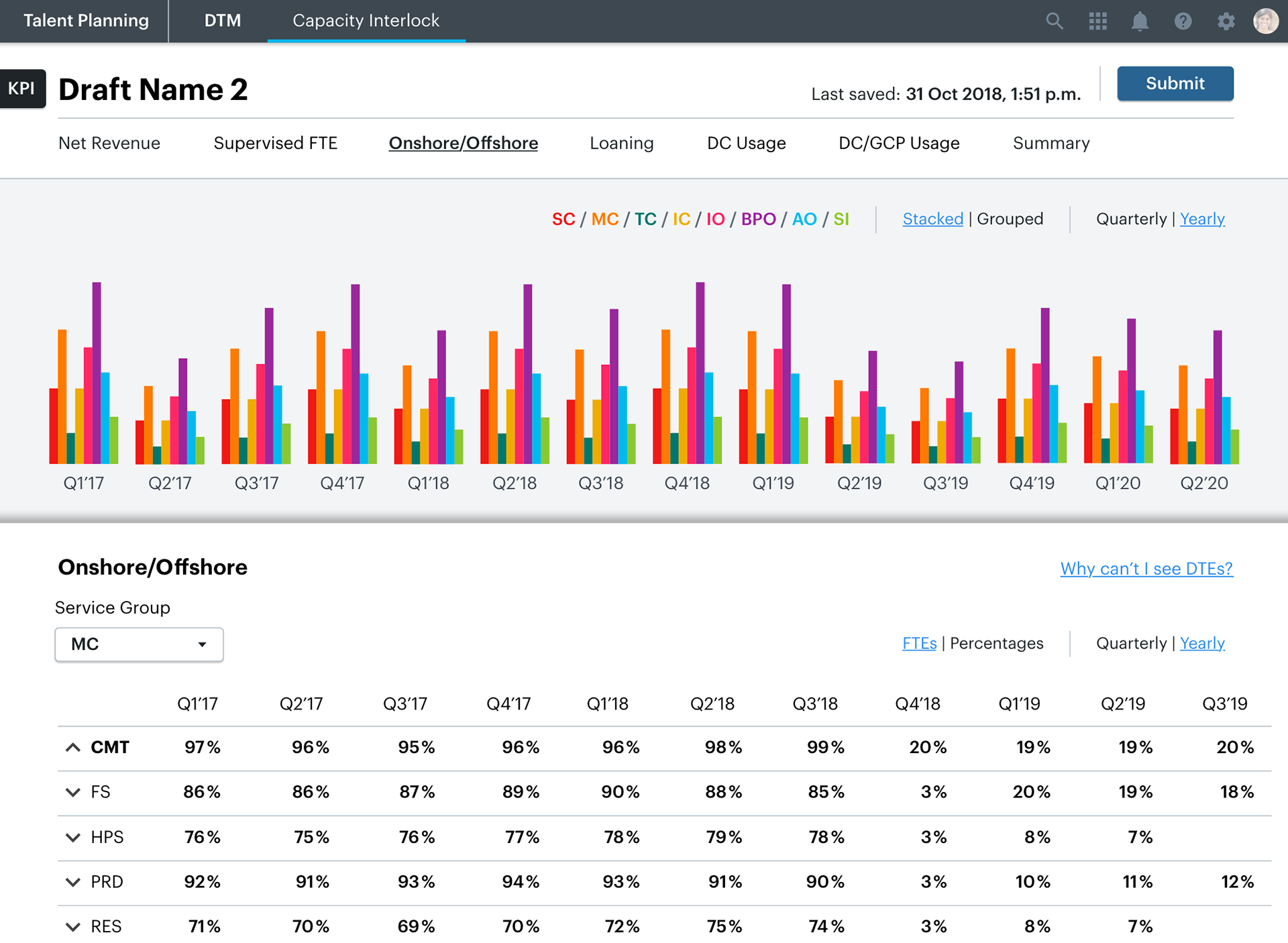
Users will have various permissions based on role and will therefore need different combinations of tools to complete their tasks. Capacity Interlock is an add-on tool accessible by tab on primary navigation. This is a high-fidelity screen taken directly from an Adobe XD layout showing an example data visualization that would be dynamically animated in the actual tool.
View a complete, arrow-through-only prototype of the entire DTM/Capacity Interlock project HERE, still embedded with all working notes and styles.
Thank you!